Wireframe validation
Tested whether the sequence and grouping of questions made sense before visual refinement.
Canada Life · Released product
A guided, responsive, and accessible reimbursement flow for plan members submitting medical expenses and supporting documents.
Project snapshot
The experience was redesigned during a broader migration from SAP Hybris to Salesforce Industries. It had to simplify claim submission while supporting complex benefit rules, responsive layouts, technical constraints, and accessibility requirements.
The problem
After paying for an eligible medical service, members needed to provide practitioner information, expense details, and supporting documents to request reimbursement. The original experience was lengthy, inconsistent, and difficult to use on mobile, leaving members uncertain about requirements and completion.
How might we create a clearer claim journey while supporting multiple claim types, platform migration, responsive behavior, and accessibility requirements?
Previous experience · SAP Hybris
These annotated wireframes document the experience before the platform migration. Members moved through a long sequence of claim-type decisions, eligibility questions, expense fields, document uploads, and final confirmation.
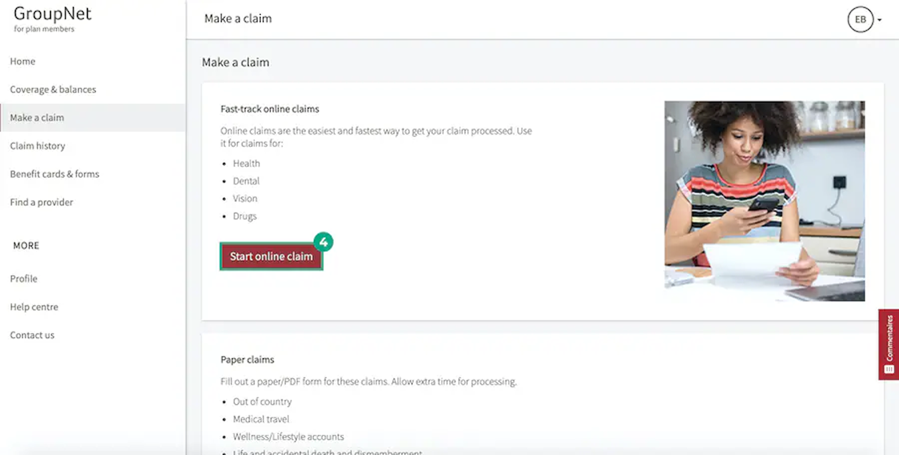
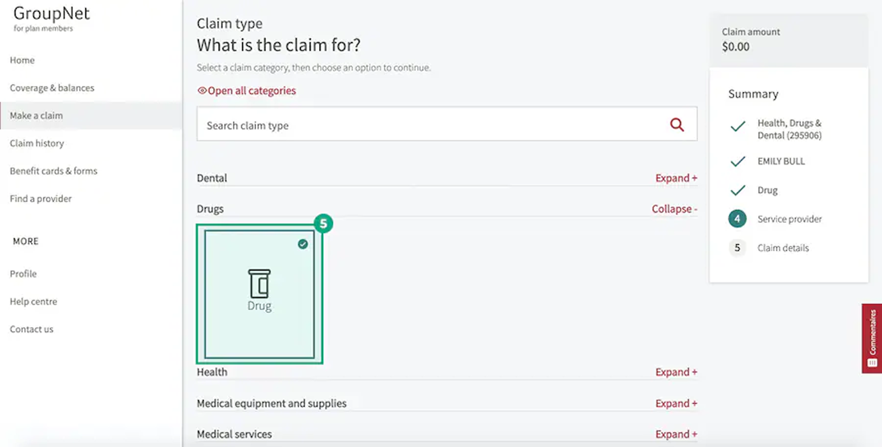
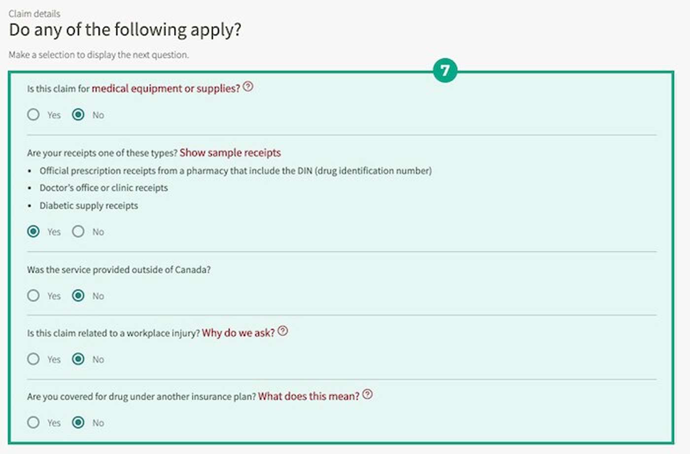
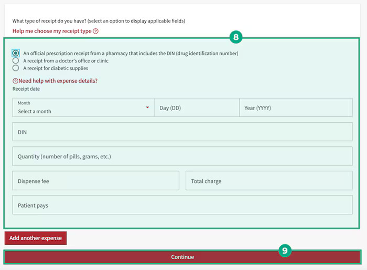
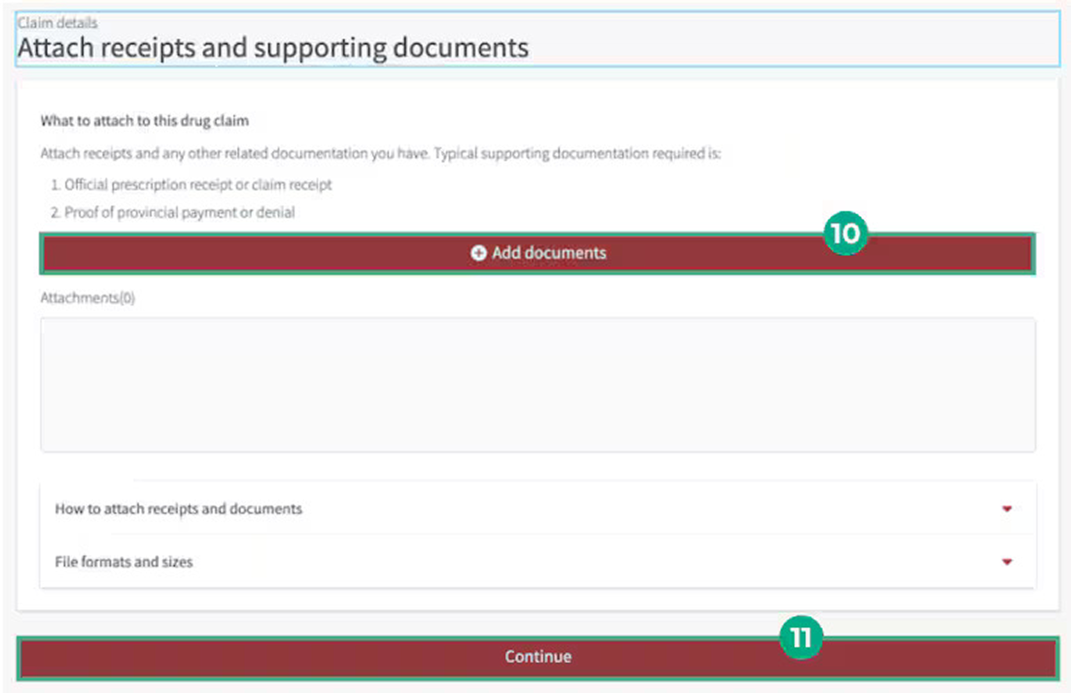
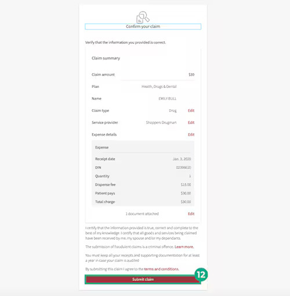
Select any wireframe to view it at full size. Screens use sample account data from the original portfolio artifact.
Research and validation
The redesign used two rounds of usability testing with plan members. Wireframes were used to evaluate flow structure and comprehension; high-fidelity prototypes were used to examine readability, hierarchy, and accessibility.
Tested whether the sequence and grouping of questions made sense before visual refinement.
Tested clarity, visual hierarchy, upload guidance, and the overall sense of confidence.
Feedback informed content hierarchy, button language, and instructions for supporting documents.
Released experience · Evidence review
I reviewed the complete set of 79 unique desktop and mobile screenshots as a system—not as isolated pages. The evidence covered claims, estimates, responsive layouts, navigation states, document uploads, recovery guidance, and confirmation patterns. The six frames below show the core medical-claim story while keeping the adjacent estimate flow outside this case study’s main narrative.
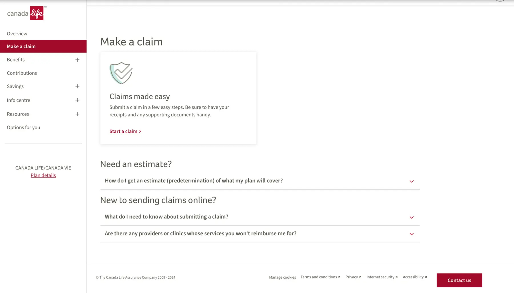
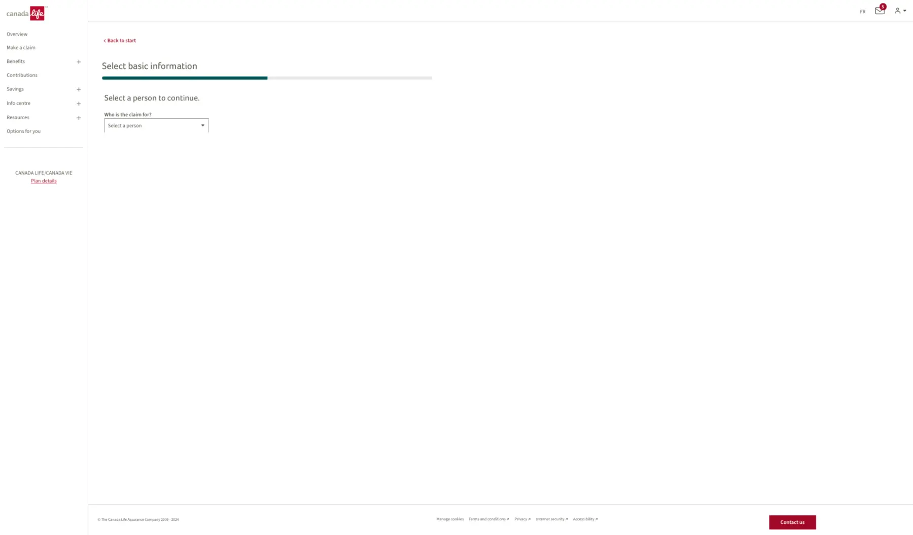
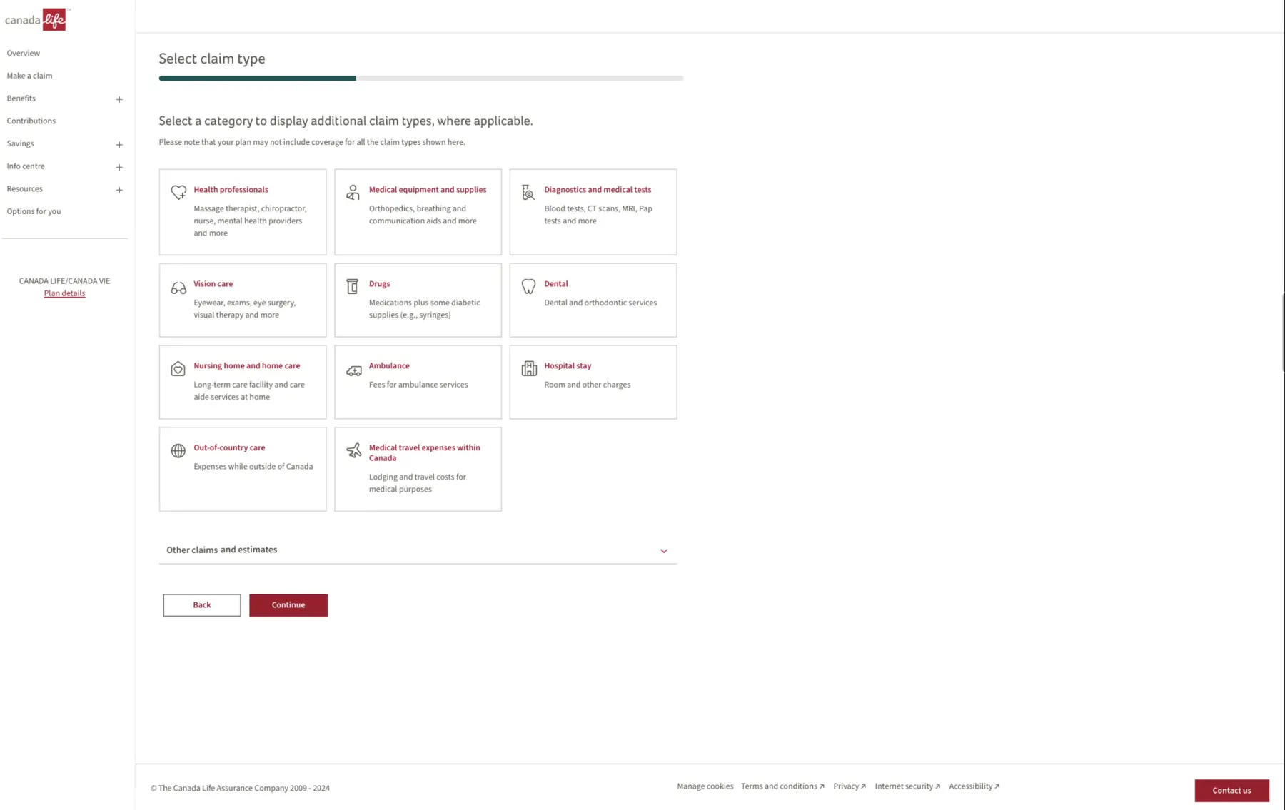
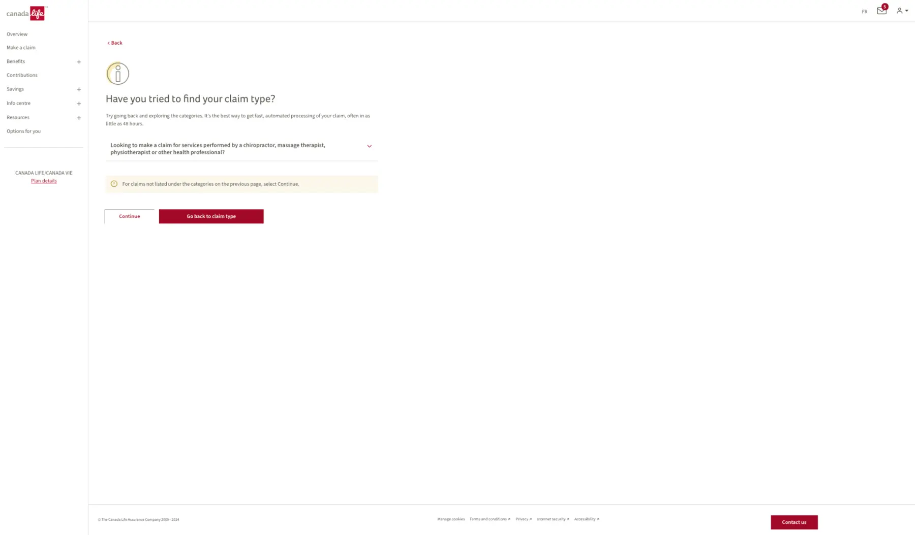
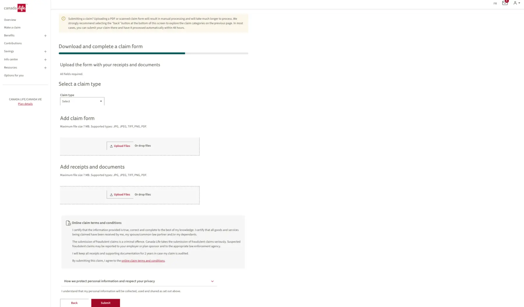
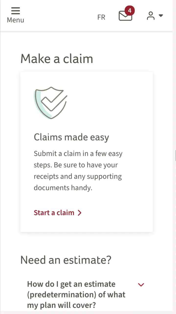
Frames were selected from the full screenshot audit and de-identified for portfolio use. Select any frame to inspect it at full size.
Design decisions
The flow focused members on one group of related information at a time, replacing long forms with a step-by-step structure.
Receipt and supporting-document guidance appeared near the relevant action, with upload instructions refined through testing.
Real-time validation, clear required fields, focus behavior, and confirmation states helped members resolve issues earlier.
Responsive experience
Members may submit after a healthcare visit, from home or on a phone with receipts nearby. Reviewing both viewport families exposed more than layout differences: controls had to remain reachable, headings had to wrap predictably, and long upload and privacy content needed a usable reading order.
The released experience preserves the same information hierarchy and direct path into the claim journey across screen sizes.
Explore the interactive Figma prototypeShipped product
Static screens make the interface scannable; these recordings show the sequence and responsive behavior of the product that shipped.
Experience model
Outcome
faster average completion in usability testing
accessibility level reported at launch
to production in the group-insurance portal
The completion-time result reflects usability testing rather than platform-wide production analytics. The project material reports fewer support calls directionally, but no verified count or measurement period was available, so that claim is not presented here as a measured result.
Accessibility and delivery
I collaborated with engineering through design reviews and worked with accessibility, QA, content, and product partners as the experience moved toward release.
The work addressed clear labels, understandable validation, contrast, keyboard and focus behavior, readable hierarchy, and mobile-friendly spacing. Continuous WCAG fixes and usability refinements continued beyond the initial launch.
Reflection
Simplifying an experience does not mean removing the system’s complexity. It means deciding when users encounter it, explaining it clearly, and working with technical partners so the intended experience survives implementation.
Return to selected work